Small bit of functional graphic design I like
Apr 8th, 2026
I watch a lot of sports. Hundreds of hours every year. All major competitions that are broadcast here and some that require finding international sources.
Last night, I watched another round of UEFA Champions League and every broadcast I’ve enjoyed this tiny element in the clock & score graphic in the top corner:
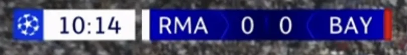
The white and red stripes next to the team abbreviations tell you what the colours of their kits are. Real Madrid is playing in white while Bayern München is playing in red.
It blends in so well, takes no attention to itself and if you don’t watch a lot of games, you might not even realise that’s what the colours stand for. That’s what makes it so genius. While it’s almost unnoticeable, it provides such a crucial bit of information, especially if the teams generally share a colour (which these teams don’t).
If you join a match mid-game, you don’t have to try to figure out which team is which. A quick glance at the top corner to see what the score is and how much has been played and you immediately know who is who.
I often feel that in sports, there’s a lot of assumptions of what the viewer should already know. Recognising the kits is one of those things.
I love how this design reduces that burden from the viewer.
If something above resonated with you, let's start a discussion about it! Email me at juhamattisantala@gmail.com and share your thoughts. This year, I want to have more deeper discussions with people from around the world and I'd love if you'd be part of that.